Portico
Scaffolding
One of NYC’s largest and most successful scaffolding companies came to us with an ambitious prototype, a next-generation scaffold system designed to challenge premium competitors like Urban Umbrella. But they didn’t just need a name. They needed a strategic identity that could reposition scaffolding from construction eyesore to urban design asset.
Our
Process
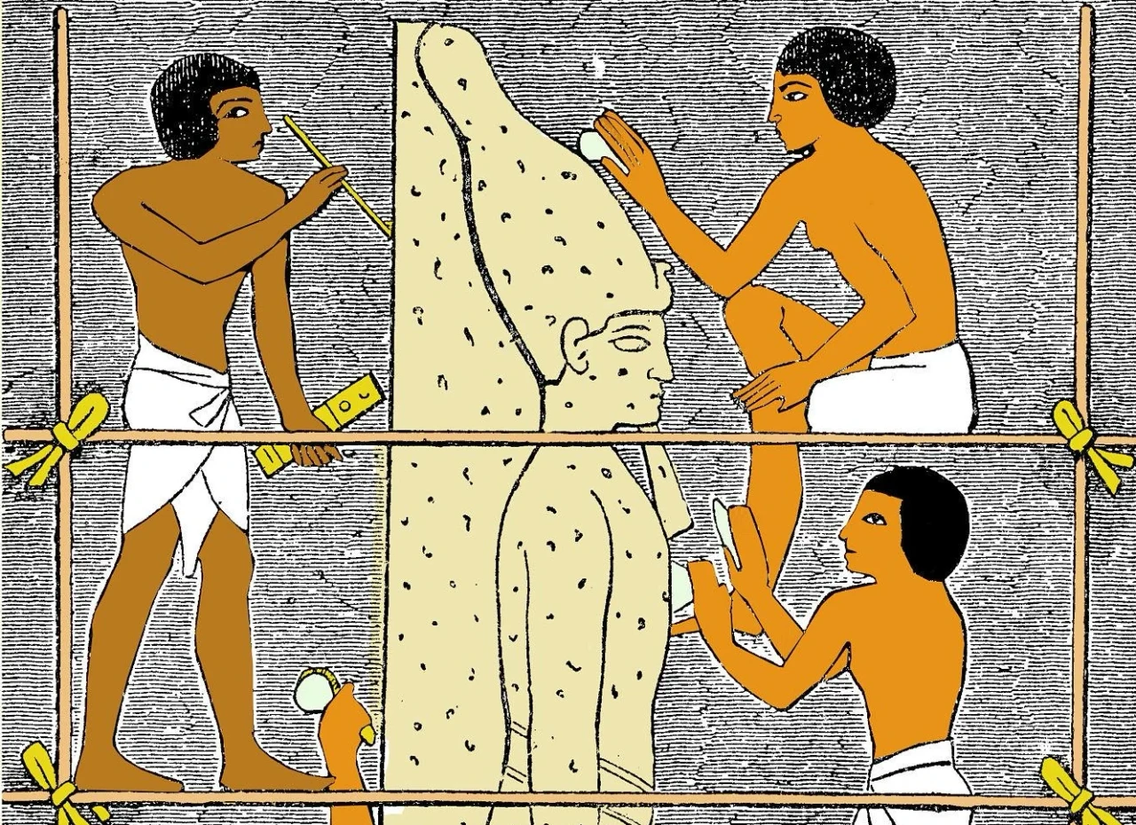
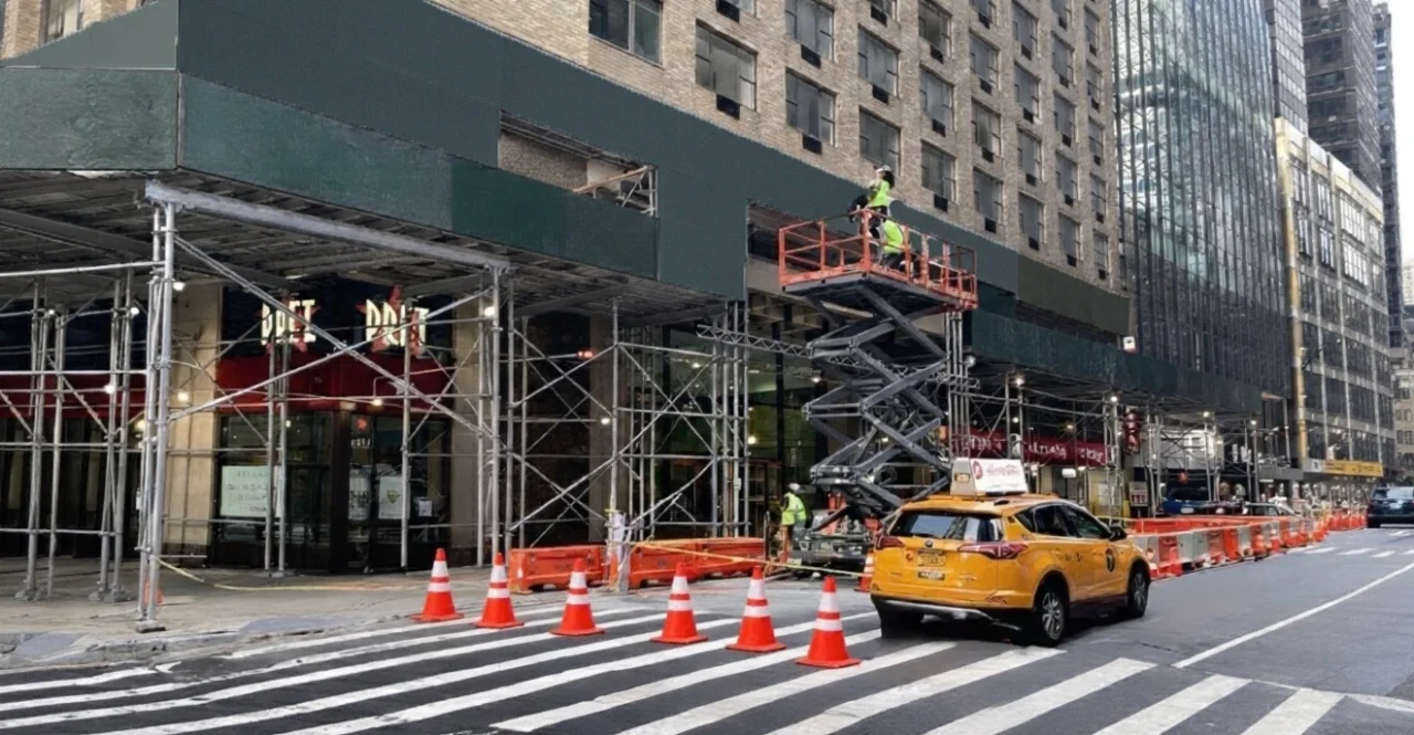
Our process began where most branding firms wouldn’t think to look, the deep history of the trade itself. That history gave us our strategic frame: this client’s new system isn’t an incremental product improvement, it’s the next chapter in a centuries-long evolution of how we build and inhabit cities.
Our recommendation: PORTICO. The name and identity, it’s masculine, modern, and structurally confident. The logo employs a solid horizontal orientation that mirrors the physical form of scaffolding itself while integrating seamlessly with the client’s existing corporate brand.
Our
Outcome
PORTICO positions our client to do something no scaffolding company in New York has credibly attempted: redefine the aesthetic standard of the city’s streetscape while maintaining cost and operational superiority. It’s not just a better product. It’s a better story.